Why Fintech Branding Stopped Looking Like a Bank (And What Replaced It)
Finance software used to earn trust by looking boring. That stopped working the moment it started acting on your behalf.
When I think about finance software, I picture a dull blue or green logo and a stock photo of two people shaking hands. For decades, that was the point. Boring meant safe, and safe meant people trusted you with their money.
But finance tools don't only show you the numbers anymore. They help you invest, pay invoices and close the books on their own. When a product starts acting for you, you want to know who you're dealing with, and that makes fintech branding as important as the product itself.
At Flexxi Studio, my team and I design brands and products for fintech companies, including the brand identity for Decaf. In this article, I look at why fintech brand identity is moving away from the bank look, what's replacing it, and how to build a brand people trust before you ask for their money.
What is fintech branding?
Fintech branding is how a financial technology company shows people who it is and why they can trust it with their money, through its name, visual identity, tone of voice and product experience. For a long time, that meant borrowing the visual language of banks. Today, the strongest fintech brands give their product a personality people can recognize and rely on.
Why do so many fintech brands use blue and green?
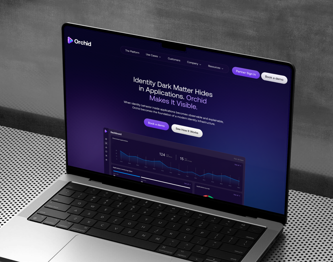
Fintech brands use blue and green because those colors are associated with trust, stability and money. The problem is that everyone had the same idea. When FXC Intelligence mapped the palettes of 144 cross-border payments brands, many used shades of blue so close they were hard to tell apart side by side. A Lazyweb review of 42 finance design systems found blue as the lead color in 17 of them.
Safe colors made sense when a finance app was a place to check your balance. They make less sense when you need people to remember you and let you act for them.
Why does brand personality matter now that AI handles money?
Brand personality matters more because finance products are starting to make decisions and move money for users, and people only hand over control to something they feel they know. This isn't a far-off future. On October 20, Visa, BILL and Billtrust launched what they called the first live pilot of AI agents paying real business invoices, limited to payments a finance team had already approved.
So the tools are getting faster, but people still want a say. That's the tricky part for finance brands right now. They need to feel fast enough to be worth it and careful enough to be trusted with your money.
In my last article, I covered the product side of this: why users don't trust AI with their money and how to show them what the AI is about to do. The brand is the other half. It tells people what kind of product they're letting in before any feature does.
Fintech rebrand examples: how Rillet and Mira build trust with personality
Rillet. Rillet is an AI accounting platform that closes the books for finance teams, exactly the kind of product people get nervous handing control to. In late October, Rillet launched a new brand identity built to make finance leaders comfortable with it. The idea was to show that fast and rigorous can go together, with a purple-led palette and a texture inspired by data moving in real time.
Then they took it to Manhattan subway stations and the Las Vegas airport, right where CFOs pass through between industry events. Not where you'd expect to see accounting software, which is exactly why it works.
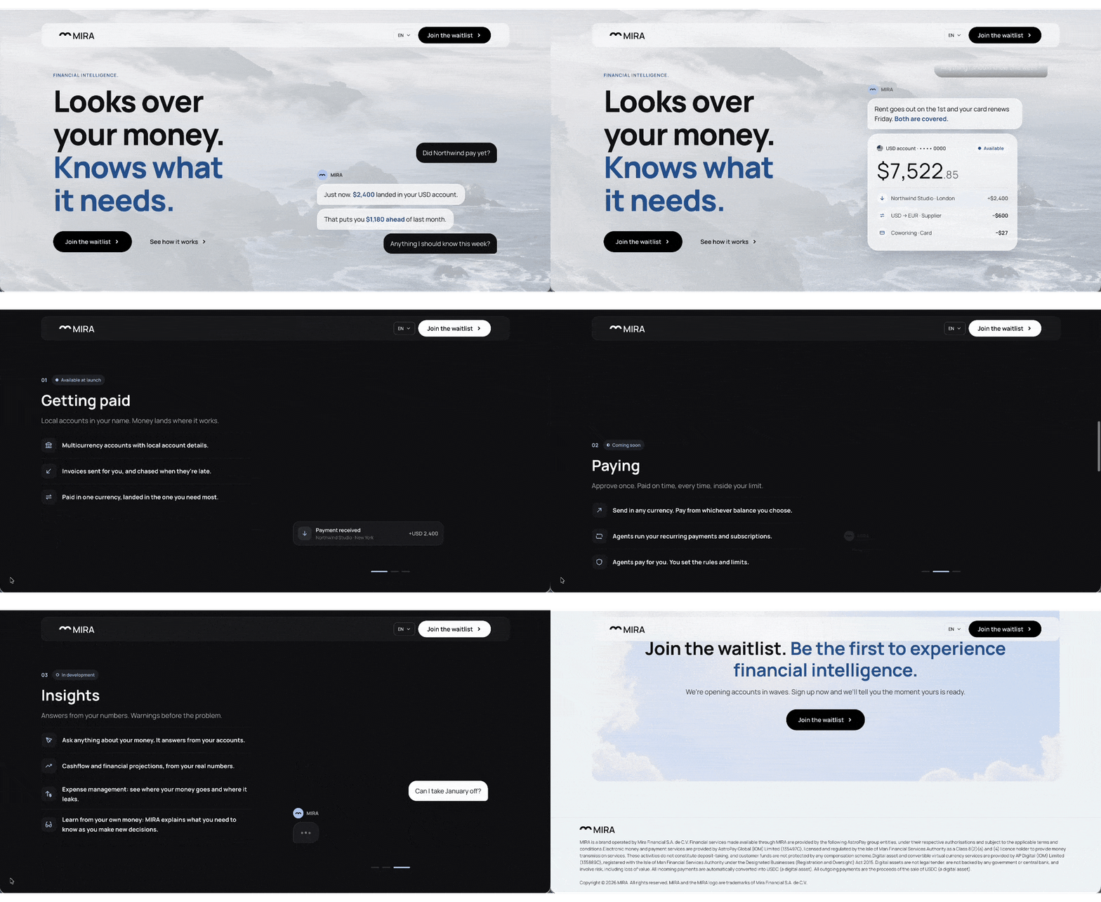
Mira. Mira is a new app from the AstroPay group. It lets you spend through a digital wallet and helps you manage and invest your balance. What I love is how it introduces itself: as a concierge that looks after your money intelligently. Soon, its AI will be able to pay bills for you, but only within the limits you set.
Mira has one personality, but it knows how to dress for the occasion. The website is calm and premium, with fog rolling over a coastline. The smartest part is the chat next to it, which works like texting a friend who knows your finances: you ask a question, and it answers in plain words. On social, Mira lets loose, hopping on trends while keeping every post on brand.
Fun fact: we helped Mira build out its team, including placing Lara as their new senior product designer. Embedding designers who already speak fintech into in-house teams is a big part of what we do. We've also worked with AstroPay on product design, including its redesigned onboarding and its design system.
Put Rillet and Mira side by side and they're doing the same thing: giving a finance product a personality you'd trust to act for you.
Decaf case study: a fintech brand identity that breaks the blue
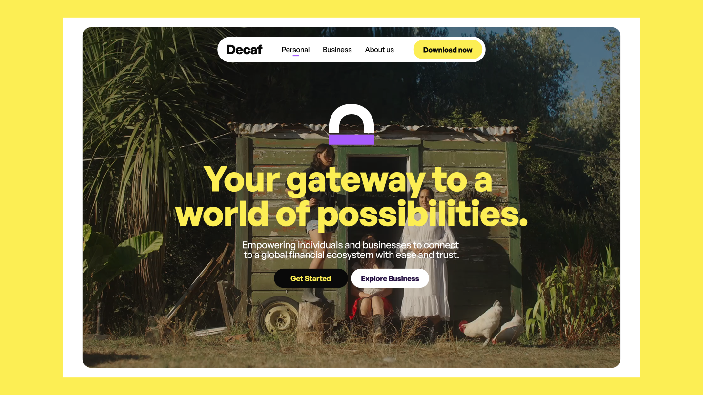
Decaf helps people move money across borders. Its users include a freelancer in Buenos Aires waiting on a payment from New York and an NGO trying to get funds to communities with little or no access to a bank. One brand had to work for both of them, which is why they brought us in at Flexxi Studio.
Decaf also sits between traditional finance and crypto. Not a combo that makes people feel safe right away. So the brand had a tough job: feel solid enough for the NGO and friendly enough for the freelancer.
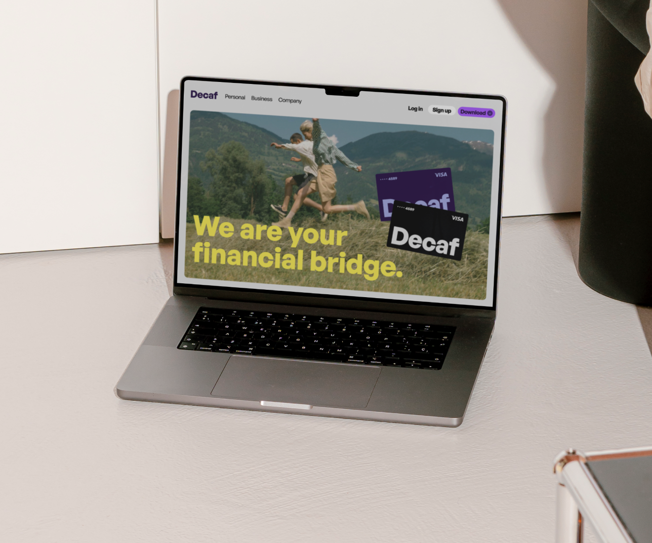
We gave it one idea to stand on: "Your financial bridge." Decaf connects people and businesses to the global economy, and both the Decaf brand identity and the website grew out of that idea.
[ADD DECAF IMAGE HERE. Alt text: Decaf fintech brand identity with a bright yellow palette, designed by Flexxi Studio]
Then came the color, and that's where we picked a fight with the category. Fintech loves blue and green because they look safe. The problem is they also look like everyone else. So we went with a bright, sunny yellow. Today, Decaf is easy to recognize next to other fintech brands, and it's growing in regions where opening a bank account is still a hassle.
How to build a fintech brand people trust
Lead with one idea. Decaf's "financial bridge" gave every design decision a reason. If your brand can't be summed up in a line, your users won't remember it.
Pick color for recognition. Your product experience earns the trust. Your color's job is to make sure people can find you again.
Let the personality flex by channel. Mira's website is calm and its social is playful, and both still feel like Mira.
Show up where your buyers are. Rillet put accounting software in an airport because that's where CFOs were.
Introduce yourself before you ask for money. Before your product asks for people's money, your brand should already have told them who they're dealing with.
Want more on fintech, design and AI?
Every issue of my newsletter, Flexxible by Design, brings real stories from client work and what I'm learning along the way.
Subscribe to Flexxible by Design →
Frequently asked questions
What makes a good fintech brand?
A good fintech brand is easy to recognize and makes it clear what the product does for you. Trust comes from how the product behaves, and the brand's job is to make that experience feel familiar everywhere people meet it.
Should fintech companies avoid blue?
Not necessarily. Blue still signals trust, but so many finance brands use it that it rarely helps you stand out. If you keep it, something else in the identity has to make you recognizable.
How does AI change fintech design?
AI changes fintech design because products now act for users, like paying bills or closing the books. The product has to show what the AI will do, and the brand has to make people comfortable handing over control.
What is a fintech rebrand?
A fintech rebrand is when a financial technology company updates its visual identity, messaging or name, often to match a new product direction. Rillet's 2026 rebrand, for example, launched alongside new AI capabilities for closing the books.
Can a fintech brand be playful and still feel trustworthy?
Yes. Mira's social content is playful while its website and product stay calm and clear. The personality stays consistent, and only the tone changes with the channel.
Building a fintech brand that needs to earn trust?
My team and I design brand identities and products for fintech companies, and you can see more of that work in our fintech case studies. If you're working on one, I'd love to hear about it.
Sources
- Visa, Visa, BILL and Billtrust Launch First Live Pilot for Trusted AI Agent Payments
- CPA Practice Advisor, Rillet Unveils New Brand Identity
- FXC Intelligence, Why blue dominates payments industry branding
- Lazyweb, What brand colors do finance apps use
Related reading
- Why Users Don't Trust AI With Their Money (And How Product Design Fixes It)
- How We Built an AI Asset Generator That Keeps Every Team On-Brand
Want more on fintech and design? Subscribe to my newsletter, Flexxible by Design →
Notifications and Alerts