How Design Turned Session Replays into Insight Engines
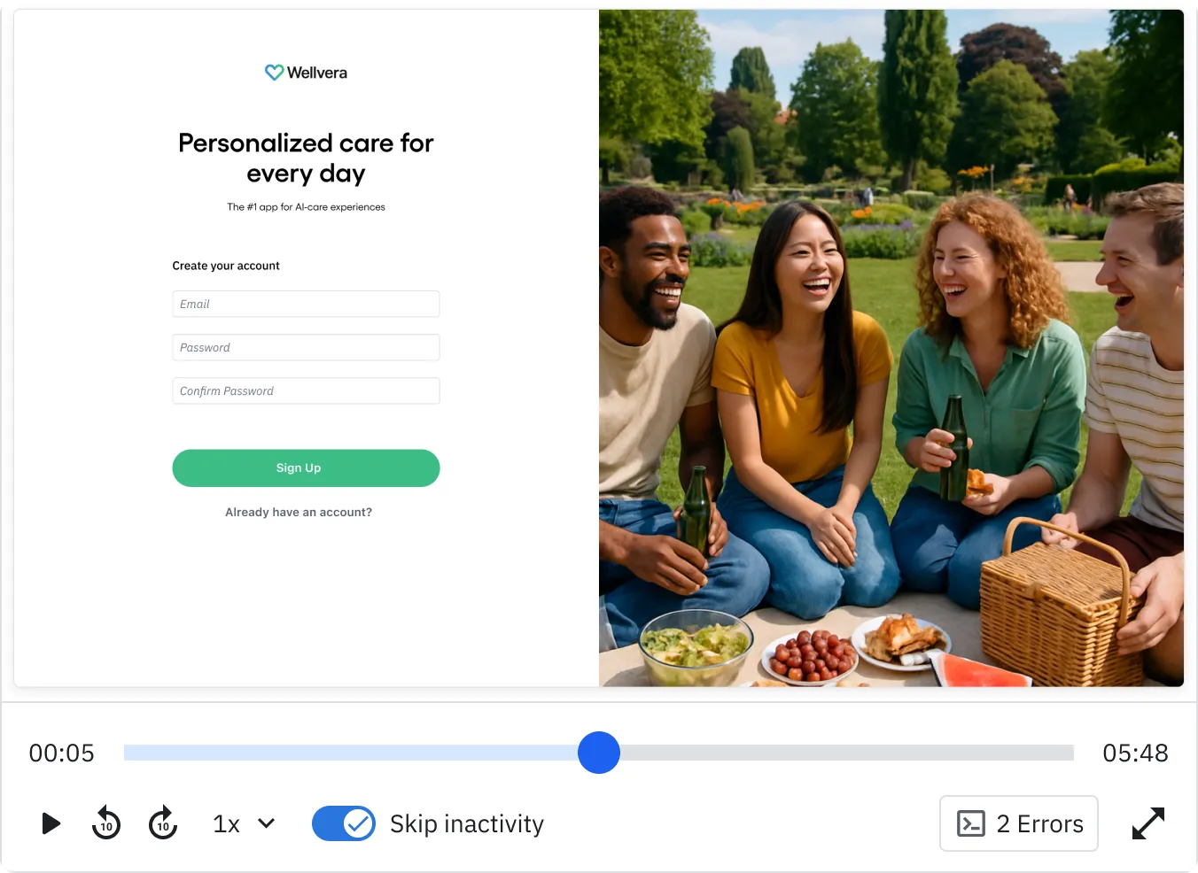
When it comes to understanding user behavior, few tools are as powerful as session replays. They allow product teams to see what the user saw: clicks, scrolls, interactions, and even moments of struggle. But there’s a catch: user sessions don’t always last a neat and tidy two minutes. They can be as short as a few seconds or stretch into hours, even days.
While Session Replays are rich with information, no one has the time (or patience) to sit and watch hours of footage. The challenge for designers, then, is clear: how can we make long and complex sessions navigable, actionable, and useful?
At Amplitude we faced exactly this challenge. Our solution went beyond adding features. It required a complete redesign of the way users interact with the replay player.
Complexity Beyond Human Attention
A single session can contain dozens, sometimes hundreds, of interactions. Users might open multiple tabs, click back and forth, encounter errors, or drop off suddenly. For analysts or product managers trying to learn from these journeys, watching everything linearly isn’t feasible.
Our legacy player reflected this reality. It was built for straightforward playback. Users could press play, scrub through a timeline, and jump around. The need to surface the most relevant parts of a session without forcing people to watch everything arose.
Instead of treating sessions as unstructured “videos,” we began layering signals on top of the raw replay. These signals acted like highlights in a book, guiding users to the moments that matter most.
Here are the key signals we introduced:
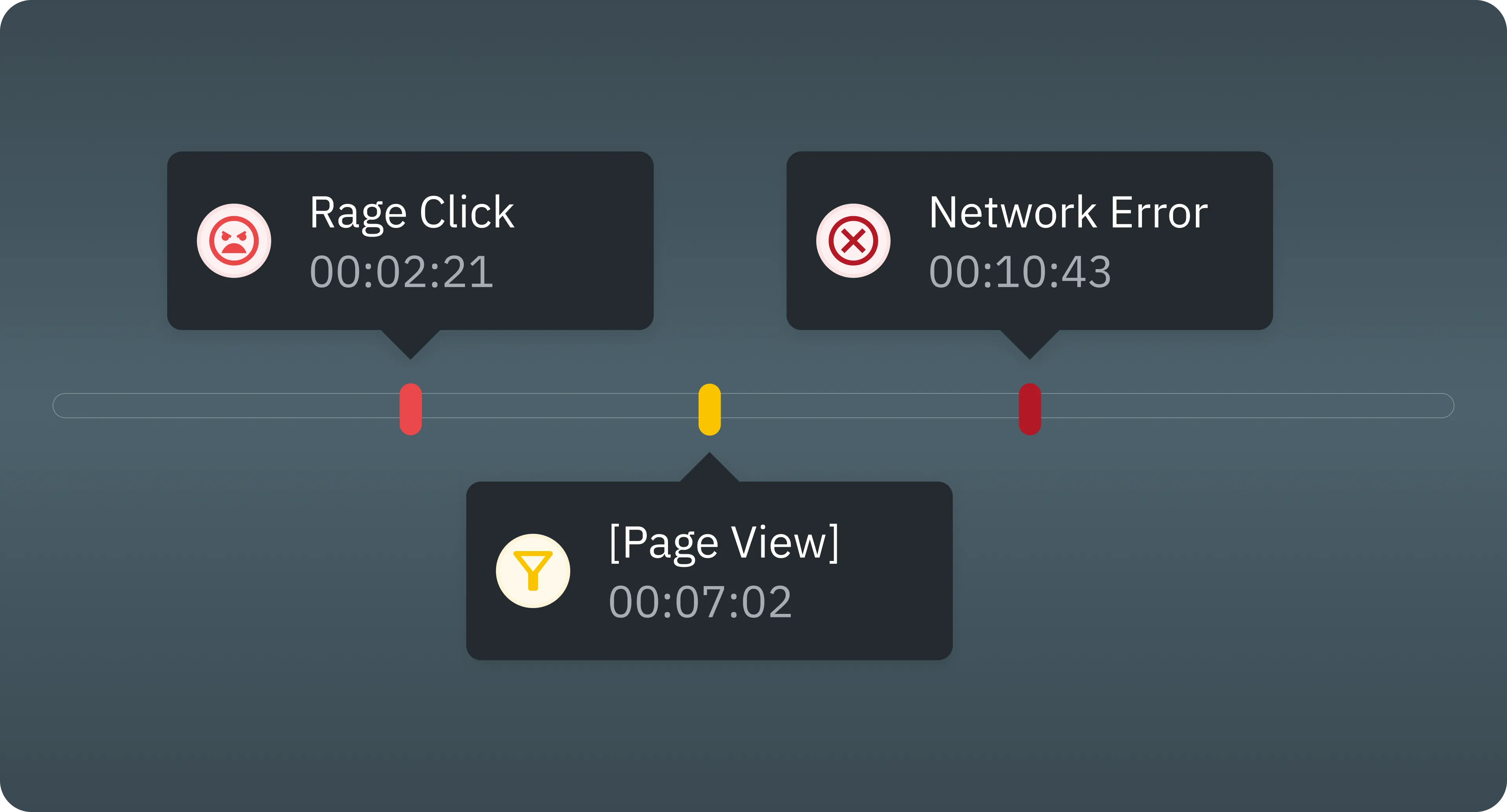
- Frustration Events
- Rage clicks and dead clicks are some of the clearest indicators of user pain. They help analysts skip directly to moments where the user struggled, instead of guessing where frustration might have happened.
- Network Error Events
- Sometimes the biggest UX problems aren’t visual but technical. Network failures that prevent content from loading can completely break an experience, and surfacing these moments lets teams see where reliability issues are impacting journeys.
- Filtered Events
- Users often arrive at a replay from a funnel or chart filtered by specific criteria (for example only users from a certain segment or only failed conversions). It’s critical that this context isn’t lost when watching a replay. The player now reflects these filters directly, showing which events matched the original query.
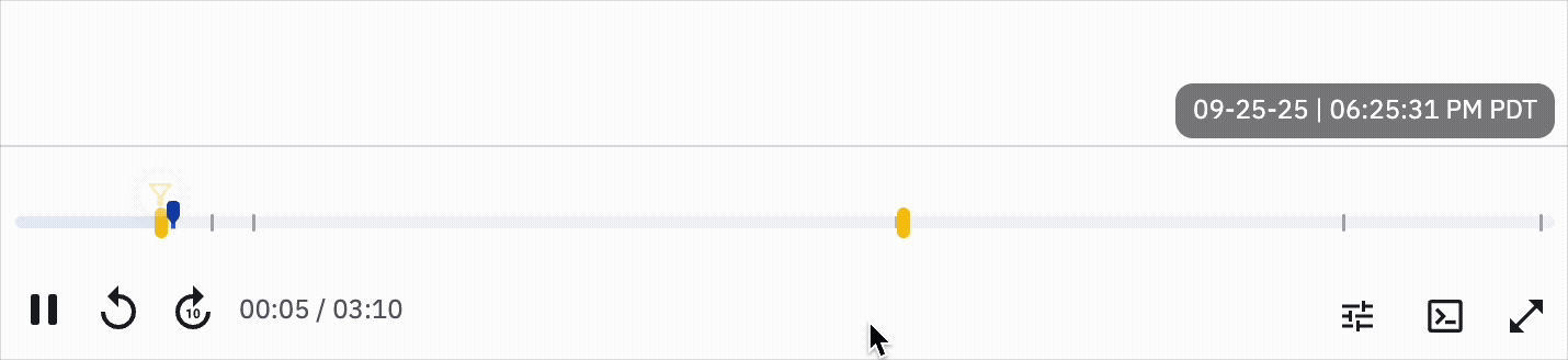
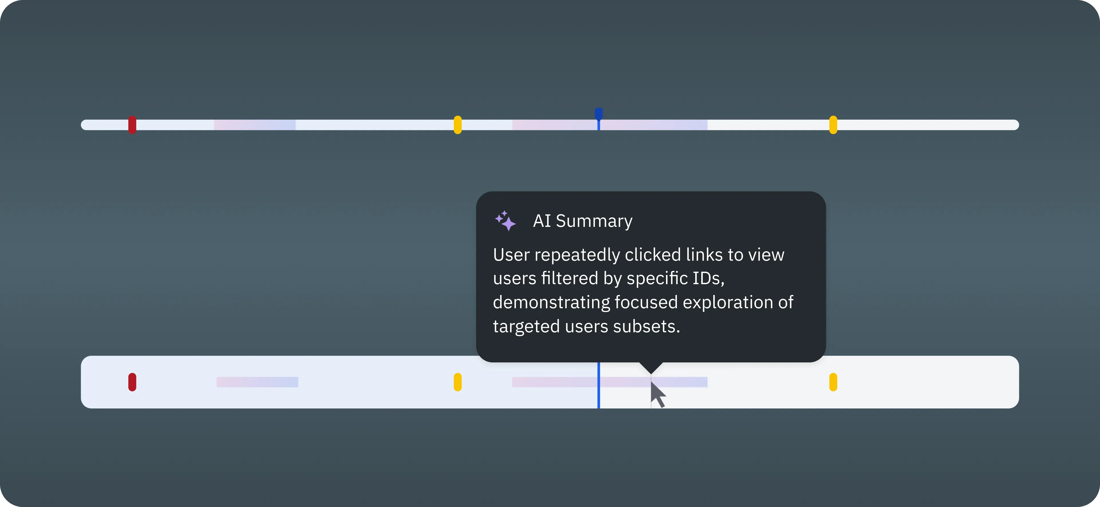
- AI HighlightsAI-generated highlights are now displayed directly on the player timeline. Each highlight appears as a marked segment, with its description shown in a tooltip on hover, making key moments instantly visible and easy to interpret.
With these signals, a replay stops being a linear video and becomes a map of meaningful events.
But there was a catch: our old player wasn’t built to handle this kind of complexity. The timeline could only represent basic playback, not layers of metadata.
Adding signals meant facing several design challenges:
- Density of information: How do you show dozens of signals without overwhelming the timeline?
- Scannability: How can users glance at a session and immediately see the “hot spots”?
- Navigation: How do you allow quick jumps between events while maintaining context?
- Consistency: How do you ensure the player still feels intuitive, even with new types of interactions?
In short, the design problem wasn’t just what to show, but how to show it.
Redesigning the Player Experience
We decided the replay player itself had to evolve. Instead of a simple linear scrubber, the new player became an interactive canvas for exploration.
Key elements of the redesign included:
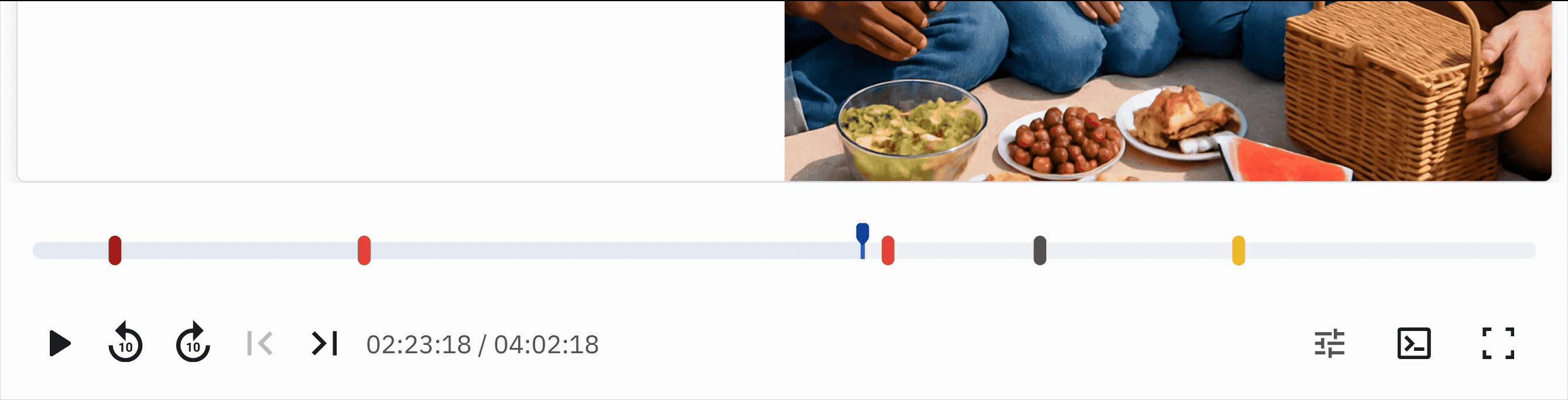
- Event markers on the timeline

- Different signals are represented visually. Frustration events, network errors, filters, and AI highlights each have their own markers. Users can spot them instantly.
- Jump navigation & context persistence
- Clicking on an event marker jumps directly to that moment — 2 seconds before that moment, to be exact. No more scrubbing blindly to “somewhere in the middle.” If a replay was launched from a filtered funnel or chart, that context is visible in the player. Users don’t lose the “why” behind the replay they’re watching.
- AI-generated summaries
- Highlights appear as annotations, allowing users to skim the replay as a narrative rather than only a video.
The result is a tool that adapts to sessions of any length. A 30-second session is still straightforward to watch end to end, while a multi-hour session now has guideposts that make it digestible.
Solving for density of information
While adding markers and bars to the player helps highlight key moments in long sessions, it also risks overwhelming both the interface and the users. Too many visual elements can make navigation confusing.
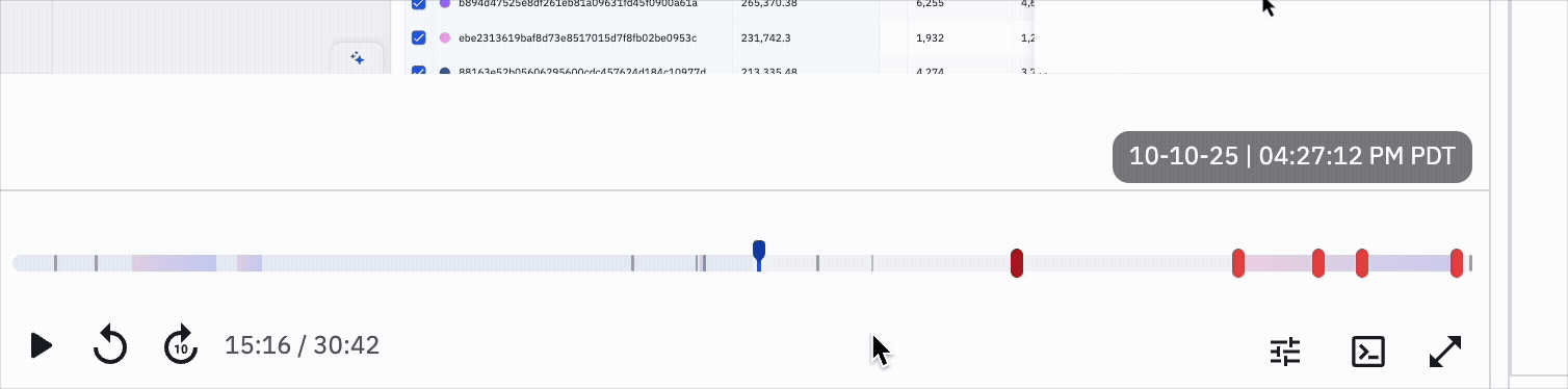
To address this, we made smart use of component states. In its default state, the component stays compressed, taking up minimal space on the player. When users hover or interact, it expands automatically, giving enough room to explore markers comfortably without cluttering the timeline.
Lessons for Product Designers
While this work was specific to session replays, the lessons apply broadly to any product dealing with large, complex datasets:
- Users don’t want raw data. They want meaning.
- Watching 10 hours of footage is data. Jumping to the 2 minutes that matter is insight.
- Design for signals, not noise.
- The value of analytics tools lies in surfacing the anomalies, not in faithfully reproducing every click.
- Representation matters just as much as information.A poorly designed interface can make powerful signals invisible. Redesigning the player was just as important as adding new events.
- Context is part of the data.
- If someone arrives with a filter or a segment in mind, that context must carry over into the experience. Otherwise, the tool feels disconnected.
- What you don't show matters just as much as what you show.Beyond that, knowing how much information to show in each step of the user flow is key to have a clear and direct user interface that conveys meaning and usefulness to users.
Conclusion
Designing products that handle complexity is never just about adding features. It is about rethinking the core interactions so users can extract value quickly and intuitively.
In the case of session replays, the challenge was bridging the gap between hours of raw behavior and moments of actionable insight. By layering signals, redesigning navigation, and leveraging AI, we turned sessions into stories that teams can actually use.
For product designers everywhere, the takeaway is clear: when your product deals with scale, whether it’s hours of video, thousands of events, or millions of data points, the question isn’t how much you can show, but how effectively you can guide your users to what matters.
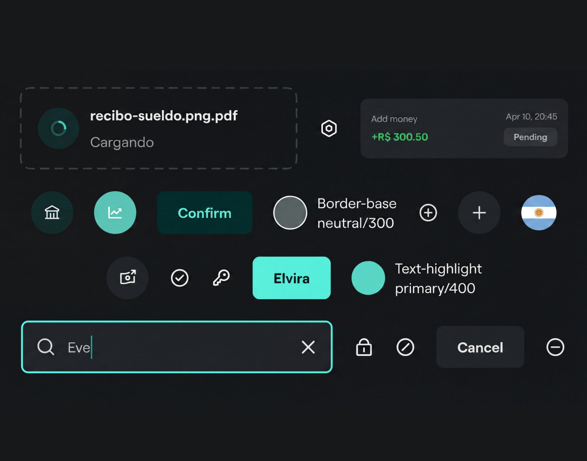
Notifications and Alerts